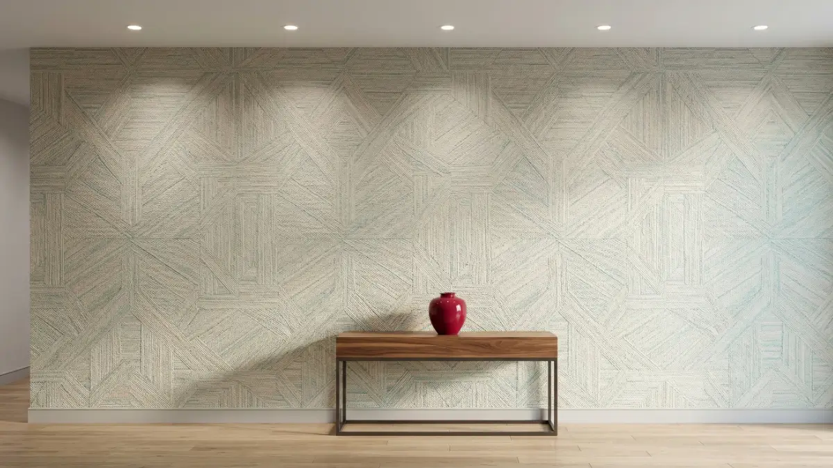
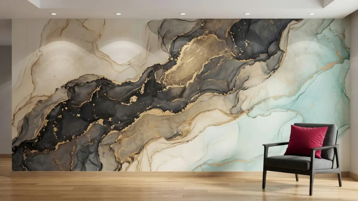
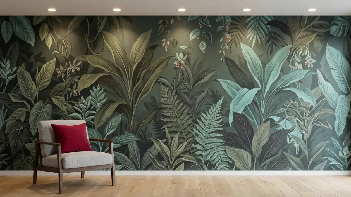
Professional wallpaper tips dictate that you must select your wallcovering first, using it as the foundational artistic anchor for the room. By strategically applying color theory—such as complementary or monochromatic palettes—and balancing the scale of your patterns with heavy physical textures, you guarantee a cohesive, high-end interior design without visual clutter.
Moving Beyond the Swatch: Executing Your Vision
Finding a specific pattern or color that you genuinely love is only the very first step in the renovation journey. The true challenge lies in making that design actually work within the physical constraints of a room. With thousands of bespoke designs, digital murals, and textured finishes available, decision fatigue is incredibly common.
To make matters more complicated, choosing window treatments, soft furnishings, carpets, and accessories to perfectly complement your chosen wall covering can feel like an impossible puzzle. If handled incorrectly, the room quickly descends into chaotic visual noise.
At Unique Impressions, we don’t just print and hang materials; we engineer comprehensive interior design solutions. When you read about us and our 18+ years of industry mastery, you will understand that executing a flawless room requires strict discipline. Follow these professional wallpaper tips from our experts to stay on track and ensure your final aesthetic is nothing short of breathtaking.
Tip 1: The “Wallpaper First” Strategy
The most common mistake amateur decorators make is buying all their furniture and rugs first, and then desperately searching for a wall covering that matches perfectly. This almost always ends in compromise.
Consider your custom wallpaper as a massive, foundational work of art. It should provide the direct inspiration and overarching direction for your entire design scheme. It is infinitely easier to start with a breathtaking wall mural and pull accent colors from it to dictate your upholstery, rather than trying to match a printed wall to a highly specific sofa. Build the room from the walls inward.
Tip 2: Emphasize Architectural Style
Before you begin scrolling through digital libraries or requesting sample swatches, you must firmly establish a style profile. This profile should actively respect your home’s inherent architecture.
A hyper-modern, metallic geometric print will clash violently inside a heritage Victorian home featuring ornate crown moldings. Conversely, a delicate, vintage damask will look absurd in an industrial, exposed-brick loft. Because premium collections are generally curated by theme, firmly deciding on an architectural style allows you to aggressively narrow your search, saving you hundreds of hours of frustration.
Tip 3: Master the Science of Color Theory
Once the overarching style is locked in, you must consider the exact color scheme you want to achieve. Having a strict scheme in mind allows you to concentrate purely on choosing the right “coordinates” for curtain fabrics, cushions, and lighting fixtures. Consider implementing one of these four proven color strategies:
Complementary Schemes
Colors positioned on exact opposite sides of the color wheel (such as deep navy blue and burnt orange, or rich emerald green and warm terracotta) create a bold, highly dynamic look. This strategy injects massive energy and strong personality into a room, making it ideal for entertainment spaces or striking corporate branding and fabrication zones.
Analogous Schemes
These are colors positioned directly next to each other on the color wheel (such as blue, teal, and green). Analogous spaces are inherently calming and relaxing because the colors naturally harmonize without friction. To allow a bold analogous mural to make a statement, utilize stark neutrals—like charcoal grey, crisp white, or matte black—for your primary furnishings.
Monochromatic Schemes
A monochromatic scheme utilizes a single base hue alongside various shades, tints, and tones of that exact same color. This is widely considered the easiest strategy to master when mixing heavy patterns and prints. A strictly black, white, and grey scheme featuring two different wall patterns easily accommodates a massive variety of bright, eclectic accessories to create a highly stylish, editorial space.
Triadic Schemes
This advanced scheme achieves a perfectly balanced, highly colorful aesthetic by utilizing three colors positioned in a perfect triangle on the color wheel (e.g., primary red, blue, and yellow). When utilizing a triadic scheme, let the wall covering carry one dominant color, and relegate the other two strictly to small accent pieces like pillows and lamps.
Tip 4: The Rules of Experimenting with Pattern
A bold, oversized graphic design executed in a neutral colorway is incredibly adaptable and can be easily combined with solid-colored furnishings. However, it takes professional skill and practice to mix multiple prints in a single room without inducing visual vertigo.
The golden rule of pattern mixing is scale. If your wall features a massive, oversized botanical print, your rugs or cushions must feature a very small, tight, micro-pattern. Never mix two large-scale patterns in the same visual plane.
Pro Wallpaper Tip: If your existing furniture is already heavily patterned (like a plaid armchair or a floral sofa), you must keep the wallpaper simple. Opt for a highly textured, solid color to ground the chaos. Alternatively, turn a standard striped pattern completely horizontal during installation to immediately stretch the room and create a modern, unexpected look.
Tip 5: Incorporate Heavy Physical Texture
If you are hesitant to use bright colors, you must rely on physical texture to add vital dimension to a monochromatic palette. Flat walls bounce sound harshly and feel cold to the touch.
Several modern wall coverings feature a lovely, profound textural quality. Heavy embossed vinyls, thick faux-grasscloths woven from natural reeds, and raw silk imitations interact beautifully with the lighting in your room. Ceramic vases with embossed surfaces, gleaming mercury glass, and the natural warmth of wooden furniture all harmonize perfectly with a tactile wall. You can even extend this layered texture to your glass partitions by incorporating our custom vinyl window films, ensuring every architectural surface possesses depth.
Execute Your Vision with the Experts
With thousands of designs, colors, and heavy textures to choose from, these professional strategies will help you turn any standard room into a highly curated masterpiece. Stop guessing, and start designing with absolute certainty.
Ready to start your design journey?
Need to see these color theories in action? Browse our extensive portfolio of past projects, or join our design community to witness our high-end installations firsthand on Instagram, TikTok, and YouTube.
Frequently Asked Questions: Wallpaper Design Tips
1. Should wallpaper be lighter or darker than the other walls?
There is no strict rule, but it depends on your goal. If you want the wallpaper to be a dramatic, receding focal point, choosing a darker mural for an accent wall works brilliantly. If you are wrapping the entire room to make it feel airy and spacious, the wallpaper should remain lighter in tone.
2. How do I match wallpaper to my existing carpet or flooring?
Treat your flooring as a neutral base. If your carpets are a warm beige or brown, pull warm tones (like gold, terracotta, or cream) into your wallpaper. If your floors are cool grey concrete or dark hardwood, utilize cool tones (like navy, silver, or emerald green) to ensure the undertones harmonize.
3. Can I put wallpaper on every wall in a room?
Yes, absolutely. While accent walls are popular for massive, overwhelming murals, wrapping an entire room in a subtle, highly textured, or small-scale repeating pattern creates a highly immersive, cozy, and cohesive “jewel box” effect.
4. What is the best way to light a textured wall?
To maximize the impact of textured wall coverings, utilize “wall grazing” lighting. This involves installing ceiling downlights or track lighting very close to the wall, directing the beam straight down to cast dramatic micro-shadows across the raised tactile surface.
5. Do I really need to hire a professional interior designer?
While you can select patterns yourself, hiring a professional ensures that scale, color theory, and spatial flow are mathematically correct. Professionals prevent you from making expensive mistakes, such as buying a pattern that clashes with your architecture or ordering the wrong material for a high-traffic zone.
208 Views